Prominent Call to action buttons
A prominent button on your website that prompts your users to take part in an “action” can come in variety of ways, including allowing your customer to sign up to your newsletter or a (CTA) as simple as an add to cart function. Call to actions buttons are a great tool to persuade your customers to take action in your products/services and hopefully it will help generate more sales and traffic to your website. Amazon’s buy with 1-Click is an extremely popular CTA button as it speeds up to the process of e-commerce for customers.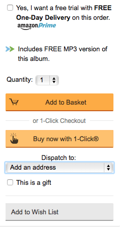 image courtesy of www.amazon.co.uk
Microinteractions
Ever liked or shared anything online? That’s a microinteraction right there. Whether it’s a liking a cat video on Facebook or a sharing a news story, these interactions are an integral part of all websites and should be implemented in a subtle way. Generally we don’t notice these interactions until they go wrong, but sometimes they can be elevated to highly useable features. For example, YouTube automatically pauses the video when a user decides to report it.One Page websites
Another fairly popular trend in web design is taking advantage of having a one page website, that is, all the website pages on one long scrolling page. Website designs in 2015 have seen an insurgence of longer scrolling pages, why? Because users are now preferring to read the content on one single scrolling page as it’s more natural and it keeps them enticed to read the entirety of it. Hopefully this is the start of the end for gallery-view websites that insist on showing one page per sentence.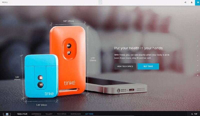 image courtesy of https://www.zensorium.com/product-tinke.html
User Experience (UX) Design
UX design is a process that designers use to enhance the customer experience or their satisfaction. This method of design involves creating an interactive and user-friendly journey for customers. According to research by Econsultancy, 88% of online customers are less like likely to return to site after a bad experience. Urban Outfitters have incorporated some stunning UX design on their website: when looking at a product; you can do 360° view of the product. Customers can also zoom in on the products to see them in more detail.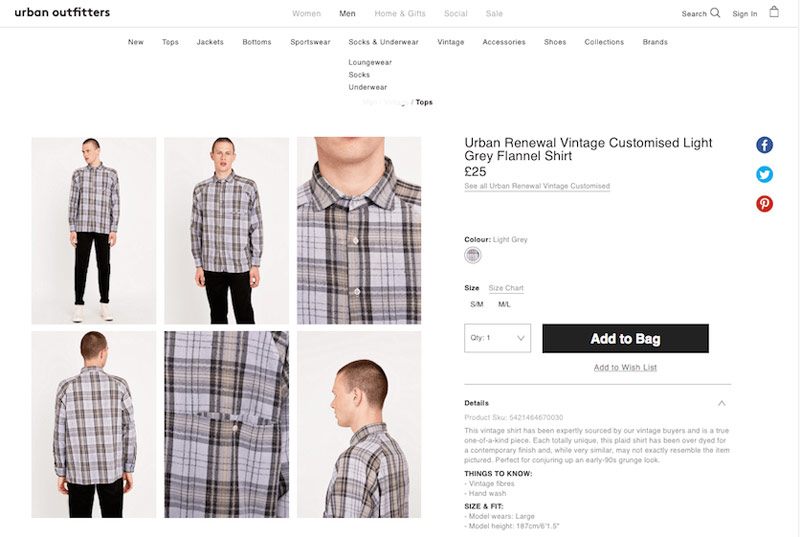 image courtesy of www.urbanoutfitters.com
Ghost buttons
Ghost buttons are transparent and empty buttons which consist of basic shapes such as rectangles or squares. It also includes a very thin outline and then text would then be inserted inside of the box. This sleek, simple technique can really make your content stand out.Card design (Modular)
Pinterest famously started this trend and now it’s practically everywhere on the web. By having cards as a design layout, it gives users a chance to easily read digestible information. This trend has also had a huge impact when it comes to designers creating mobile-friendly websites as it allows for simple navigation. This technique is also excellent for sharing content easily, just look at Google Cards.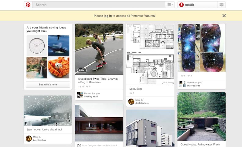 image courtesy of www.pinterest.com
Responsive Websites
In April 2015, Google announced that mobile friendly websites will be a ranking factor on mobile phone searches. That is, mobile friendly sites will rank higher than non-mobile friendly sites when searched from mobile devices. Responsive design has enabled designers to create experience optimised for the device being used, whether it be a tablet, a mobile phone or a super high resolution monitor.Hamburger Menu Icon / Mobile Menu on Desktop
With the growth of responsive design, the hamburger icon has become ubiquitous. For the majority of users, it’s an intuitive way to present the navigation on smaller devices, but for a significant few it can result in the menu being overlooked. The general method involves hiding the navigation, only to show it when the hamburger icon is clicked. Studies show that the word “menu” is more effective - anecdotally we've had 3 clients call up in the last few months reporting that their menu had disappeared, all because they didn't understand the purpose of the hamburger icon.Minimalist design
Minimalist design involves a very clutter-free approach to design, which is ideal for the creative industry as it allows your work to do the talking rather than copious amounts of text. If you are going to utilise this type of design, then you must ensure that you have a clear message on what your website involves, whether you’re selling a product/service or providing information.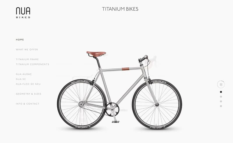 image courtesy of http://www.awwwards.com/web-design-awards/nua-bikes