Optimised for mobile
"Did you know that 2015 was the first time that mobile traffic exceeded that of desktop users and it looks to continue that way too." If your website isn't mobile-friendly then you could be missing out on a lot of potential customers, especially if you're an online retailer. Consumers are using their mobiles for practically everything, e.g. paying for groceries, playing games and using apps. You can check to see how your website performs on mobile devices by using Google's Mobile-Friendly Test tool. If you're unsure about how important it is for your website, we recently wrote a blog about the matter; "Why mobile optimisation is crucial in retaining customers", here's some digestible information from it:- Mobile users view websites differently
- It can generate traffic to your website
- Better engagement with your target audience
- Unoptimised site could potentially damage your brand
- It's estimated that there will be over 5 billion users by 2019.
Responsive Design
Responsive design is when your website is designed so that it looks great on all devices i.e. mobile and tablets. If someone accesses your website on these devices and they either have to zoom in or out, scroll horizontally or the links are to small to read then they'll be more likely to leave the website and go on a competitor's site. This type of design isn't just a trend with larger companies anymore, it's fast becoming an integral part of a web design project. If you're wondering how does this affect SEO, in simple terms it's all down to the accessibility of your website. If someone visits a non-responsive site and can't perform a simple task; then the probability that they'll leave the site is going to be higher than that if they visited a mobile-friendly site. Google will pick up on this, as their algorithm identifies the bounce rate on your website therefore ranking the mobile-friendly sites higher. Google prefers responsive design over having a separate mobile site as it makes the website more user-friendly and functional for the user. Our website is responsive on all devices and we can build your site with the same functionality.
Usability of your website
The usability of your website can affect how search engines rank your pages; therefore it is imperative that your website is user-friendly. If users find it difficult to use your website then your bounce rate is going to be high; so here's some key points on how to make your website highly accessible to users and to decrease the bounce rate:- Your site should have a simple navigation tool and be easy to use
- The content on your pages should be engaging and relatable to what your website offers but also of a high-quality
- Alt images tags should be optimised (this is how Google identifies what the image is)
- Check your website for any errors using this free software 'Screaming Frog', it crawls your website and identifies any issues with your site, which could be affecting the usability of the site.
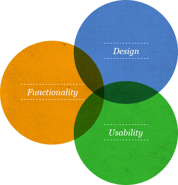 image courtesy of fatcow.com
XML Sitemaps
A sitemap is simply a file where you can list each of your web pages of your website in order to tell search engines about the organisation of your site's content. They are also great as they provide valuable meta data that is associated with the pages that were last updated. Google recommends you would need a sitemap if your website fits within these criteria's:- You have a very large site, the web crawlers (Google) may overlook some of your new pages or the pages you have recently updated, so it's good to get a XML sitemap
- Your website has an extensive archive of pages that aren't linked to each other or are isolated
- You have a brand new site; that would mean very few external links to it
- If your website has sitemaps-compatible annotations, rich media content and/or is shown with Google News.